이미지 · 영상
스위스 포스터 디렉팅
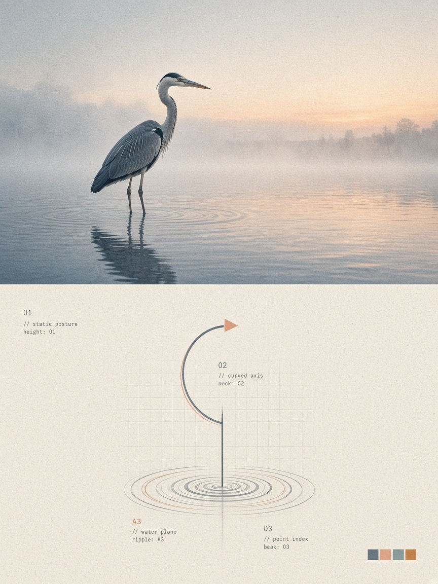
업로드한 이미지를 상단 50% 실사, 하단 50% 스위스 스타일의 추상 기호 포스터로 재구성합니다.
- 추천 툴
- GPT ImageAI 분류
- 쓰인 기법
- 구조화된 프롬프트 · 아티스틱 디렉션
프롬프트 원문
Transform my uploaded photo into a standalone, premium-quality 3:4 vertical design poster. Divide the entire canvas into two perfectly equal horizontal sections: the top half (50%) and the bottom half (50%). The upper section should feature realistic photography, while the lower section should present an abstract visual symbol derived from the core identity of the subject.

TOP HALF – REALISTIC PHOTOGRAPHY

Preserve the original subject's structure, realistic textures, natural lighting, shadows, and original color atmosphere. Apply only subtle, sophisticated color grading to achieve the aesthetic of fine-art photography and independent editorial publications.

The background may be naturally extended to fit the canvas, but never stretch, distort, or alter the original subject.

BOTTOM HALF – ABSTRACT VISUAL IDENTITY

Extract the photograph's essential visual characteristics: the subject's silhouette, structure, posture, and narrative relationships. Do not recreate the entire object. Instead, reduce it into a recognizable abstract visual symbol.

Use geometric deconstruction, modular shapes, structured lines, negative space, and symbolic elements to create a central visual identity inspired by premium branding and experimental design systems.

Focus on the subject's core character rather than minor details. Even with minimal geometric elements, the abstract symbol must remain visually connected to the original photograph.

VISUAL STYLE & DESIGN LANGUAGE

Post-digital graphic design, deconstructed Swiss design, generative symbol systems, and diagrammatic abstraction.

Build a systematic visual language using geometric modules, fine lines, circular trajectories, grids, micro-symbols, numerical indexing, and abstract nodes.

Create visual tension between:
- Order × Imperfection
- Precision × Handmade Traces
- Digital × Analog
- Rationality × Emotion

Achieve strong visual recognition using the fewest possible elements. Keep everything minimal and avoid unnecessary complexity.

COMPOSITION & LAYOUT

Maintain a highly restrained composition. The abstract symbol must be the sole visual focal point, positioned centrally or slightly off-center, surrounded by generous negative space.

Avoid excessive icons, decorative elements, or infographic-style layouts.

The overall aesthetic should resemble the core visual identity of contemporary art institutions, architectural studios, experimental creative labels, and premium design brands.

TYPOGRAPHY & DETAILS

Typography should function only as a supporting system component, never as a dominant headline.

You may incorporate extremely small numbers, letters, or short phrases that interact with the abstract symbol through indexing and reference relationships.

Use refined, restrained typography with the subtle annotation aesthetic of archival documents and experimental art publications.

COLOR SYSTEM

Extract the signature colors from the original photograph and reinterpret them as a cohesive brand color system.

Introduce a small number of distinctive accent colors as functional visual codes, such as teal, blue, magenta, or orange, combined with gray-white or warm-white backgrounds for contrast.

Colors should function as systematic identifiers rather than decoration.

Avoid chaotic color combinations, cheap neon effects, and generic commercial gradients.

PRINT TEXTURE & MATERIALITY

Incorporate subtle material effects inspired by:
- Xerox texture
- Risograph grain
- Print registration errors
- Scanner noise
- Subtle paper texture

Add delicate printing misalignment, fine grain, scanning noise, and slightly imperfect edges to give the digital symbols the tactile quality of physical print.

FINAL OBJECTIVE

Extract an independent and self-contained visual DNA from the original photograph.

The final result should feel like a sophisticated, minimal, culturally meaningful abstract logo with a strong visual identity and systematic design language.
한국어 풀이 보기(참고용)
업로드한 사진을 3:4 세로형 프리미엄 디자인 포스터로 변환하세요. 캔버스를 정확히 반으로 나누어, 상단 50%는 파인아트 스타일의 실사 사진을 유지하고, 하단 50%는 대상의 핵심 정체성을 추출한 스위스 디자인 스타일의 추상적 기호로 나타내세요.

상단: 원래 피사체의 구조, 질감, 자연스러운 조명을 유지하고 고급 잡지 화보 느낌의 톤다운된 컬러스케일을 적용합니다.
하단: 피사체의 실루엣과 구조를 기하학적 형태, 선, 그리드, 미세 심볼로 해체하여 최소한의 기호로 정체성을 시각화하세요.
전체적인 질감은 제록스나 리소그래프 인쇄 질감, 미세한 입자감을 적용해 미니멀하면서도 감각적인 아트 포스터 포맷을 완성합니다.
- 활용인물 사진이나 제품 사진을 함께 전달(이미지 투 이미지)할 때 가장 뛰어난 결과를 냅니다.
- 활용전시 포스터, 잡지 표지, 브랜드 그래픽 프로젝트에 활용하기 유용합니다.
- 활용이미지 생성 모델(GPT-4o, Midjourney v6 등)에 함께 이미지를 첨부하여 사용하세요.
출처 · prompts.chat · Photo-to-Poster Visual DNA: Split Editorial Photo Over an Abstract Swiss-Design Symbol (3:4) — 원문은 출처에 게시된 그대로이며, 권리는 원작자에게 있습니다.
원작 결과 이미지
원문 작성자(Fatih Kadir Akın)가 prompts.chat 에 올린 결과입니다. 원본 주소에서 표시됩니다.
mopick 개선안
원문을 더 잘 동작하게 고쳐 쓴 프롬프트
원문을 그대로 넣으면 AI 가 매번 다르게 답하거나 중요한 부분을 빠뜨릴 수 있습니다. 개선안은 원문의 뜻과 언어는 그대로 두고 역할 · 바꿔 넣을 입력 칸 · 결과 형식 · 지킬 조건을 보완해 다시 쓴 버전입니다. 원문과 같은 곳(ChatGPT · Claude 등)에 그대로 붙여 넣어 쓰면 됩니다.
AI 자체 평가 — 개선안을 쓴 AI 가 명확성 · 구체성 · 결과 형식 · 재사용성 기준(100점)으로 직접 매긴 점수 · 결과를 돌려 검증한 값은 아님
원문82
개선안94
원문의 문제 → 개선안에서 고친 점
AI 역할레슨 01 배우기 ›
원문 · 없음AI 에게 맡길 역할이 정해져 있지 않아 답의 관점 · 수준이 그때그때 달라질 수 있었습니다.
개선 · 역할을 정함Act as an elite graphic designer and visual identity specialist. Transform the uploaded ph
입력 칸레슨 05 배우기 ›
원문 · 없음바꿔 넣을 자리가 표시돼 있지 않아 쓸 때마다 원문을 직접 고쳐야 했습니다.
개선 · 4개[Insert Photo / Subject] · [Upload Photo / Describe Subject] · [e.g., Teal, Blue, Magenta, Orange, or Auto-Extract] 외 1개
고친 이유 (개선안을 만든 AI 의 설명)
- 1입력 변수([사진], [색상] 등)를 대괄호로 명시해 재사용성을 극대화함.
- 2역할 정의와 핵심 제약/부정 프롬프트를 명확히 분류하여 전달력 개선.
- 350/50 분할 구도 및 텍스처 요소를 구조화하여 생성 정확도 향상.
이 개선안에 쓰인 기법 — 프롬프트 클래스에서 배우기
원문
Transform my uploaded photo into a standalone, premium-quality 3:4 vertical design poster. Divide the entire canvas into two perfectly equal horizontal sections: the top half (50%) and the bottom half (50%). The upper section should feature realistic photography, while the lower section should present an abstract visual symbol derived from the core identity of the subject.

TOP HALF – REALISTIC PHOTOGRAPHY

Preserve the original subject's structure, realistic textures, natural lighting, shadows, and original color atmosphere. Apply only subtle, sophisticated color grading to achieve the aesthetic of fine-art photography and independent editorial publications.

The background may be naturally extended to fit the canvas, but never stretch, distort, or alter the original subject.

BOTTOM HALF – ABSTRACT VISUAL IDENTITY

Extract the photograph's essential visual characteristics: the subject's silhouette, structure, posture, and narrative relationships. Do not recreate the entire object. Instead, reduce it into a recognizable abstract visual symbol.

Use geometric deconstruction, modular shapes, structured lines, negative space, and symbolic elements to create a central visual identity inspired by premium branding and experimental design systems.

Focus on the subject's core character rather than minor details. Even with minimal geometric elements, the abstract symbol must remain visually connected to the original photograph.

VISUAL STYLE & DESIGN LANGUAGE

Post-digital graphic design, deconstructed Swiss design, generative symbol systems, and diagrammatic abstraction.

Build a systematic visual language using geometric modules, fine lines, circular trajectories, grids, micro-symbols, numerical indexing, and abstract nodes.

Create visual tension between:
- Order × Imperfection
- Precision × Handmade Traces
- Digital × Analog
- Rationality × Emotion

Achieve strong visual recognition using the fewest possible elements. Keep everything minimal and avoid unnecessary complexity.

COMPOSITION & LAYOUT

Maintain a highly restrained composition. The abstract symbol must be the sole visual focal point, positioned centrally or slightly off-center, surrounded by generous negative space.

Avoid excessive icons, decorative elements, or infographic-style layouts.

The overall aesthetic should resemble the core visual identity of contemporary art institutions, architectural studios, experimental creative labels, and premium design brands.

TYPOGRAPHY & DETAILS

Typography should function only as a supporting system component, never as a dominant headline.

You may incorporate extremely small numbers, letters, or short phrases that interact with the abstract symbol through indexing and reference relationships.

Use refined, restrained typography with the subtle annotation aesthetic of archival documents and experimental art publications.

COLOR SYSTEM

Extract the signature colors from the original photograph and reinterpret them as a cohesive brand color system.

Introduce a small number of distinctive accent colors as functional visual codes, such as teal, blue, magenta, or orange, combined with gray-white or warm-white backgrounds for contrast.

Colors should function as systematic identifiers rather than decoration.

Avoid chaotic color combinations, cheap neon effects, and generic commercial gradients.

PRINT TEXTURE & MATERIALITY

Incorporate subtle material effects inspired by:
- Xerox texture
- Risograph grain
- Print registration errors
- Scanner noise
- Subtle paper texture

Add delicate printing misalignment, fine grain, scanning noise, and slightly imperfect edges to give the digital symbols the tactile quality of physical print.

FINAL OBJECTIVE

Extract an independent and self-contained visual DNA from the original photograph.

The final result should feel like a sophisticated, minimal, culturally meaningful abstract logo with a strong visual identity and systematic design language.
개선안 · 색칠한 [칸]에 내 내용을 넣어 쓰세요
[ROLE & GOAL]
Act as an elite graphic designer and visual identity specialist. Transform the uploaded photo [Insert Photo / Subject] into a standalone, premium-quality 3:4 vertical design poster featuring a strict 50/50 dual composition.

[INPUT PARAMETERS]
- Source Image: [Upload Photo / Describe Subject]
- Optional Text/Catalog Code: [e.g., 'NO. 04', 'ARCHIVE 2024', or leave blank for auto-generated]
- Accent Color Preference: [e.g., Teal, Blue, Magenta, Orange, or Auto-Extract]

[CANVAS & STRUCTURE]
- Aspect Ratio: 3:4 vertical.
- Split Layout: Exactly 50% top half and 50% bottom half.

TOP HALF – REALISTIC PHOTOGRAPHY
- Retain original structure, realistic textures, natural lighting, and color atmosphere of [Insert Photo / Subject].
- Apply subtle fine-art photography color grading inspired by independent art publications.
- Background may be extended to fit 3:4 framing, but never distort, stretch, or alter the subject.

BOTTOM HALF – ABSTRACT VISUAL IDENTITY
- Extract the core essence (silhouette, posture, structure) of [Insert Photo / Subject] into a minimal visual symbol.
- Utilize deconstructed Swiss design, modular geometric shapes, negative space, grid systems, and micro-indexing.
- The symbol must remain visually connected to the photo while achieving strong branding recognition.

[VISUAL STYLE, TYPOGRAPHY & MATERIALITY]
- Aesthetic: Post-digital design, diagrammatic abstraction, and contemporary editorial branding.
- Typography: Minimal supporting micro-typography (archival annotations, tiny reference numbers). No dominant headlines.
- Palette: Cohesive palette extracted from the photograph + 1 functional accent color [Accent Color Preference] against warm/gray-white background.
- Print Texture: Subtle tactile print effects including Risograph grain, Xerox noise, paper texture, and slight registration misalignment.

[NEGATIVE CONSTRAINTS]
- Avoid chaotic color schemes, cheap neon, commercial gradients, distorted proportions, or decorative clutter.

[FINAL OUTPUT]
Generate a single high-resolution 3:4 vertical poster perfectly executing this photographic and abstract duality.